Thursday, October 9, 2014

Project Curvy pt. 3: References

If you go to my school and you've been snooping around the blogs of your classmates, you might be wondering why I have so little to show after six weeks. I knew what I wanted to do with Curvy (hence the storyboard), but I took a very long time in figuring out how I was going to do it. Thus, I spent a while gathering anatomy references while working on my storyboard.


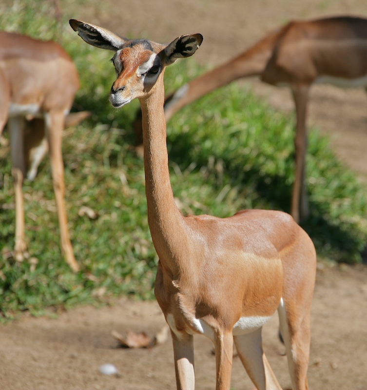
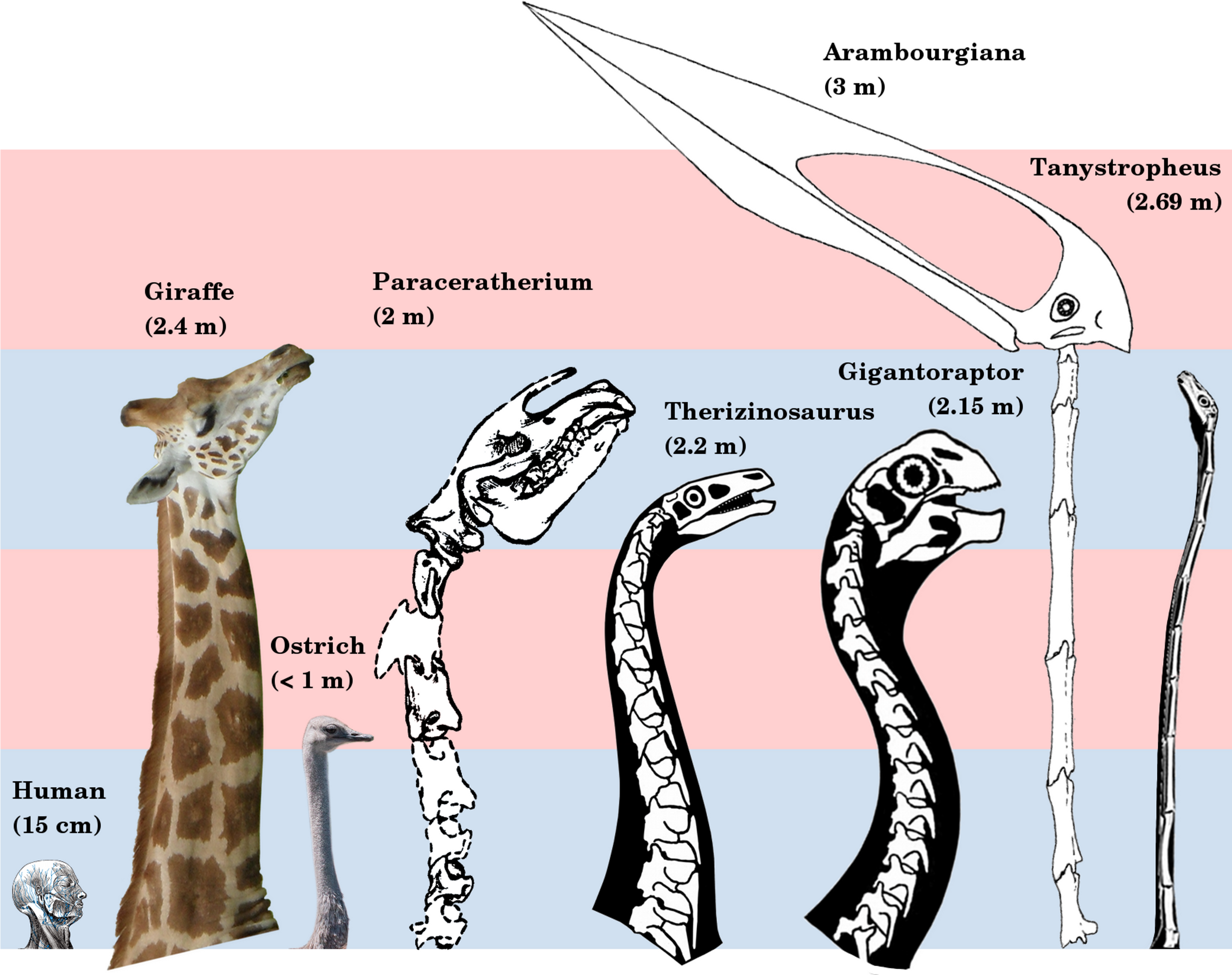
First I looked for pictures of long-necked animals - everything from deer and giraffes to Apatosaurs. I wanted to get a good idea of how Curvy's neck would look if he was an actual creature (God forbid). I would've animated him based on that mental image when he wasn't dragging his head along the floor. Plausible Impossible and all that.


Then I found and liked some guides to animating equines. I knew from experience how hard it is to draw horse legs in a still image, let alone four dozen frames. Thus, I figured I should expose myself to lots of videos of walking horses long before I would get to animating. The top video is my personal favorite.

Tuesday, October 7, 2014

Project Curvy, pt. 2: Storyboard

Here's some more concept art for, uh, "Curvy." Yeah, I think I'll just stick to that name. I may not have gotten to animating, but I hope you can get an idea of what I was aiming for.

The animation was pretty much going to be an exercise in making shapes move fluidly, the starring shape being Curvy's curvy neck. I think it would've run for at least thirty seconds.

Thursday, September 25, 2014

Project Curvy, pt.1: Concept Art

So I've been working on a hand-drawn thing for Animation class. I was supposed to post about it here a while ago, but I've felt a bit unmotivated so far this year. Here I am, thus, posting my concept art a week before the whole thing is due.

As this was going to be my first hand-drawn animation longer than 10 seconds, I didn't want to make whatever I'd bring to life too hard to draw. Since I still wanted to challenge myself a little, though, I thought I'd try making up something with four legs. Somehow I went from Waddles from Gravity Falls to a sort of long-necked, four-eared equine. If you asked me how I came up with that, I honestly wouldn't have an answer.

His limbs should be less like tentacles in the final animation.

Thursday, May 1, 2014

Video Copilot: The Hand to Hold When Using AfterEffects

A couple of weeks ago, I was tasked with choosing a tutorial on Video Copilot (.net) to follow through in Adobe After Effects. Timidly, I chose this simple video - a guide to creating a spinning Earth in outer space. 

What I had when I was finished was a little bit different from what the video shows. Sadly, this site is keeping me from uploading the 10-second file. (Maybe I set the quality too high?) All I have to upload are a bunch of screenshots I was told to take while I worked. 


I took this one early on, when I had just taken a flat map of the Earth and bent it into a sphere. The tutorial pointed me to the "CC Sphere" effect (look to the right, under the "Effects and Presets" area). It pretty much takes any picture and rounds it into a 3-dimensional sphere for you. I was scared that "making the Earth" would be a longer, more challenging process, but all I really had to do was click a button. To say I was pretty grateful is an understatement.


Here, I was getting started shedding light on the planet. The tutorial wanted me to make a bright green glow on its right outline. I was confused about it at first, but it helped with creating a realistic blue atmosphere over the sphere a while later.


Observe. I can mostly thank the tutorial that it came out this well, but I'm kind of proud of it.


The video called for a scrolling "space fog" texture underneath the Earth. It ended up purple in the finished version, but this is what the texture looked like on its own. The classic "Fractal Noise" effect worked just right after a few edits.


It's not a realistic Earth unless it has clouds, right? This picture looks really weird, I know. It actually looked like a bunch of clouds after I lay it on top of the Earth's texture (which took forever for some reason). I set a few keyframes so it would spin just a little faster than the continents below it.


This is the closest you might get to seeing the finished animation. I took this shot before waiting about 10 minutes for it to render. When I saw the result, I was honestly stunned that I had made anything so good-looking.
Tuesday, April 22, 2014

Saul Bass, Master of Minimalist Movie paMphlets

     Saul Bass is one of the names to know among budding graphic designers. He was responsible for many memorable opening and credits sequences across four decades of movies.
     As a new graphic design student, I was recently introduced to his portfolio of movie posters. Most all of them featured only five colors at most (two of them almost always being black and white) and consisted of only barely edited shapes. Even so, they got their messages across as well as any other sort of poster. Observe:

   (Now, I can't really say this one was made by Saul Bass himself--his style is often imitated due to its popularity--but it's a nice sample of what he was known for.)

(Note: I'm not sure if I can count this post as finished. I'll leave this notice here, so I can remember to edit it later.)

Monday, April 21, 2014

Who Names a Game "Kern"?


So I played a "kerning" game earlier. Yeah, I didn't know what the word meant at first, either. Wikipedia tells that it's a typography term, referring to "the process of adjusting the spacing between characters in a proportional font, usually to achieve a visually pleasing result." Fittingly, the game involved adjusting misplaced letters in word after word while being scored for accuracy. I'm surprised and satisfied with the score I got.

Friday, April 11, 2014

eMagine 2014 - A Post-Event Recap by Someone Who Wasn't There


Keeping a conflict-free schedule helps a lot when you're trying to get good grades. Sometimes, though, it seems as if the school itself wants to make that difficult. Being in E-Communications, I was expected to attend an important event last Saturday. My Forensics grade needed a boost that week, so I had signed up to debate at a tournament on Friday. (When you tell the teacher you want to go to a tournament, you can not take back that signature unless it's an emergency. I learned that the hard way.)

That tournament lasted until 8:30 pm. I woke up a few hours late the next morning, too groggy to do my homework until the next day. In the fatigue I must have forgotten my e-Comm obligation. Thanks to my obligations clashing yet again, the following recap will have to be restricted to a third-person perspective.


The eMagine Media Festival was held at Olathe Northwest to celebrate the many skilled students in the Kansas City area. By "skilled," I mean creatively skilled, as a good amount of the contestants are involved in the E-Communications program. They've made graphics, animations, and short films that they're proud enough of to let be judged by professionals and displayed to perhaps a thousand other students. The best of the best earned their creators medals, certificates, and a clear, cubic statue called the Pixel Award. To make a long story short, it's sort of like the Oscars.


One of the winning short films was shown to my Animation class. I wasn't sure about its plotline at first (it involved a man with a gun, and I hate the sight of those things), but the sudden twist at the end left me speechless in an enjoyable way. I believe its creator deserved whatever he won for it.